
Ryan: Thank you very much.
Hi, out there everyone. Hopefully everybody is doing well today. I'd like to introduce myself, my name is Ryan Stubblebine, and I am detailed here at the NCPTT for the next few months. To help with the 508 compliance and also as a visual information specialist. That's really what we're here to talk about today, we're going to talk about what 508 compliance is and really get us to start thinking about how we can start incorporating that into our daily workflows, so that we're meeting those requirements going forward.
Let's just jump right into it, I find that's a good place to begin. Just some administrative stuff, real quick, we are in listen only mode, which means I will not be able to take questions over the phone. But, you will see on your interface a little area for a chat box. If you have any questions about anything, just go ahead and plop that right into the chat box, and I'll go ahead and address that then at the end of the presentation. If, you come up with questions at the end, please just let me know, I'd be happy to answer any questions.
In addition to that, at the end of the day today, I will be providing some other additional resources, how-to guides, just some really good literature that you can take with you to really start to address the issue of 508 compliance.
The same is absolutely true for the work and information we provide to various audiences in the parks service. The work that we do is important for the people today, but also for people of tomorrow as well. And, as faithful stewards of the American story, it really is our responsibility to ensure that every person has access to the right information to suit their needs.
Section 508 is only a process to help ensure that all of the information we provide, in an online forum, is accessible to as many people as possible. And such it's the public that can benefit from this type of accessibility. Many times coworkers, colleagues, partners, stakeholders, and people just like that, can all benefit from a greater level of access. So, through this short introduction to the basic steps of compliance it's going to be my intent to show you what steps are involved in creating an accessible PDF, from Microsoft Word. This is by no means a comprehensive training. It's really more of, kind of, a taster of how we want to start structuring our workflow to include aspects of 508 compliance.
The process might be a complete re-haul of how most of us work, and it does require some time and repetition to achieve the efficiency in this type of workflow. It's kind of like a muscle, the more we exercise it the stronger it will be. There's a variety of resources available online through deal I learn, in-person trainings, all of which can provide you with a greater background to understand how to make accessible documents easier. I implore you all to find as much additional assistance resources that you can. Utilize those out there, and make sure that we're incorporating this as we move on.
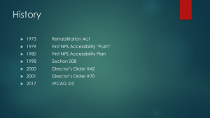
So, let's do a little bit of background about 508 compliance, and really just the addressing of disabilities as whole. It really stretches back to about 1973, when the Rehabilitation Act was signed. The Rehabilitation Act is really the first Federal identification of prohibiting discrimination just from basis of disabilities. So, this is really where we start thinking about things we tend to think of when we think about the Americans with Disabilities Act, and things like that, where we're putting curb cuts onto sidewalks, and handrails on stairwells, things like that. Wheelchair ramps. This all comes from the Rehabilitation Act to begin with. So, in 1979, the Parks Services decided to really approach this issue of accessibility in really comprehensive and an organized way. We really wanted to get out ahead of this, and really understand that our parks were destinations for the entirety of the United States, and not just people who could easily access them.
So, starting in about 1980, we started to implement our first real plan. We started working with accessibility coordinators, and regional offices, and parks, program offices, and really just started to address this issue of how we can incorporate aspects of universal design into the work that we do and the buildings we create. So, we have a little bit of a lull there until 1998 when Section 508 is created. This is really, for our intents and purposes, is the meat of what we're going to be talking about.
Section 508 has to deal with, specifically, online or electronic documents. You notice that time-frame there in 1998, Google is just starting to take off at this point. Yahoo has been on the map for only about a year or so. So, it was definitely the dawn of that internet age. We needed a law to be able to address the accessibility in the internet age. The Parks Service itself, in 2000, signed Director's Order #42, which addresses the accessibility for visitors with disabilities and National Parks Service programs and the service as a whole. So, it's really designed to develop procedures and maintain electronic information technology, that everybody has access to.
Then in 2001, we signed Director's Order #70, which has to deal with specifically publishing directly to the internet and the intranet. So, the bulk of our work, get its authority, so to speak, from Director's Order #42 and Director's Order #70. But, for us today, the most important time is going to be this past year. In January of 2017, the WCAG 2.0 is released. WCAG stands for the Web Content Accessibility Guidelines. These are the finalized guidelines of what requirements a document must meet, in order to be considered 508 compliant. Now, the reason I say this becomes very important for us, is because the Access Board determined that once this was released, that we had until January 18, 2018, as a deadline, to no longer put non-compliant documents on our public facing or internal facing websites.
What that really means for us, and a lot of time people hear about this 508 compliance and they get very concerned about maybe thousands, maybe 10's of thousands of documents that might already be online. We will address things that have already been done. What we are more focused on at this point, is how we move forward and address 508 compliance in the future, starting today.
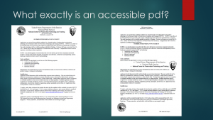
Now, let's take a look at another document. This one looks decidedly different. The information is exactly the same. The same words, or wording are used in both of these documents. There's no difference in the content. But, this one's much more difficult to figure out. Now, this document on the right is not completely unusable. Given enough time I think all of us would eventually be able to figure out what the document is trying to say. We all have enough information gained through daily life, to inform us how to read this document. This is exactly what an example of a document looks like, to someone who is in need of a Section 508 compliant document, but does not have access to one. The information is there, but it would take that individual a good deal of time to figure out what the message is. That's really what 508 is. It's a document that has enough information for those with disabilities, to be able to access the information, effectively, easily and logically. Section 508 deals completely with providing equal access to information.
Utilizing the tenants of creating a Section 508 compliant document will help us to provide supporting information, provide logic and a reading order, so that individuals with disabilities can have access to the information. It's that easy. We're just going to provide enough information to let enough people be able to read it.
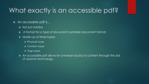
The actual PDF itself is going to be made up of three individual layers. The first layer is going to be the physical layer. This is going to just be the visual appearance of the of document. What you see when you first pick it up. Not any of the content, or anything like that, but literally just the physical look of that document. The layer underneath there, is what we call the content layer. On the content layer, this is going to reveal all of the content that we have, any verbiage, any text, any graphics. Anything that is there is going to be found, in terms of content, is going to be found on our content layer. And then finally, in purposes of 508 compliance, we have what's known as a tags layer. And, a tags layer becomes really important because that is really going to be the key, or the legend, that our assistive technologies are going to use, to be able to access the information that is in our content layer. That's what the accessible PDF does, it allows for a universal access to content, through the aid of an assistive technology.
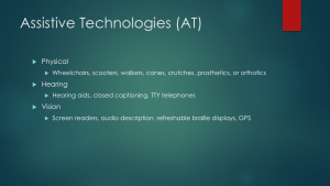
Folks who might have hearing disabilities, things like hearing aids, closed captioned videos, tele typing telephones, all can assist in getting information across to individuals who have a difficult time hearing. And then, for our purposes, is more often than not, folks with vision disabilities that use things like screen readers, or an audio described video. A refreshable braille display. Or, even in some cases, GPS can be considered a type of Assistive Technology.
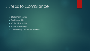
So those Assistive Technologies can really, really help folks experience the world how those of us without disabilities are able to experience the world. So, it's going to be up to us, to provide those things like screen readers, the information that we're providing to everybody else. How are we going to do that? We're going to take five steps to our document compliance. Those five steps are going to sound really easy and they're going to be a pretty straightforward process, but again, it might be a rehaul of how we do our typical work. So, please, just remember to always flex this muscle, keep exercising it and keep working at it.

How do we do it? Well, there's basically two paths that you're going to go through to create a 508 compliant document. Either, you're going to work on the file from the beginning to end, and you're going to create your own accessible PDF. Or, you're going to create content that will be given to someone else to create an accessible document, even if you're just creating the document to give to somebody else. We can still set them up for success and get used to this new workflow, by preparing it so it's a much easier conversion into a 508 compliant document.
Let's take a look at what we mean by setting up this document. Setting up a document is really one of the first, obviously the first, but one of the most important aspects of the entire process. Because, it helps everyone involved in the process, locate, open, and switch between the documents. I don't know if you've ever had the experience of working on the wrong version of something out there, but we all know how absolutely frustrating that can be, and more seriously, it can be a very big time waster. We really want to make sure they're we're labeling our documents very easily to understand, concisely, and in way that it would be hard for somebody to confuse what we're trying to do.
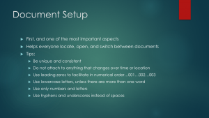
We don't want to attach anything that can change over time, or location. I like to use the example of our Centennial Year. Any work that was started before the Centennial Year and going to be done through the year 2016 and then continued into 2017, was probably not the best practice to name that as a Centennial project because it's not specifically static to that Centennial Year. We really want to make sure we're being as static as possible with how we're naming our documents.
I always recommended the use of leading zero's to facilitate a numerical order. 000 is going to be easier to maintain in a long list of different versions than just 1,2,3. It really helps to keep everything even, clean and concise.
I always recommend using lower case letters, unless there's more than one word. Then you'll want to capitalize the first letter of each of those words.
These last two become very important for a specific reason. We really want to do our best to stick to only numbers and letters. That is because this is the most portable type of document format that we have. We need to make sure that whatever software we're going to be uploading our documents into, are going to be able to understand what's there. Certain special characters can have a difficult time being read by different software programs, so really limiting your use of special characters is a wise choice, just in general practice.
In addition to that, the use of hyphen's and underscore's instead of spaces is also recommended because in a lot of programs, spaces are considered to be a special character.
Those are some real basic tips. I took all of these tips from the National Archives and Records Administration website. It's a great resource if you ever have concerns or questions about the best ways to keep track of all of your documents and file storage and things like that, so it's a really great area to check.
Now, there are other cultures around the world that don't read in this same fashion. Some Asian cultures, like Japan for example, use a form of writing called Patagucci. Which structures their writing from top to bottom, but they scan from right to left. In fact, the ancient Egyptians used to write from the bottom of the page to the top, which was one of the reasons early researchers had a difficult time truly understanding the Hieroglyphics.
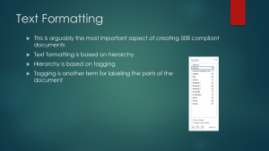
This all becomes really important, because the Assistive Technology is essentially a new reader. In the sense that it does not have years of experience with reading in the western way. It is necessary to provide the Assistive Technology with direction on how to read the material that's on the screen. What we're really doing, is we're trying to get in there and provide a legend, or a key, for that Assistive Technology to understand what's being processed on the screen. The text formatting is going to be based on a hierarchy. So, that hierarchy, just like an outline would be, and you can kind of see this styles box on the side here, with some terms you're probably familiar with. Things like Title, Subtitle, Heading 1, Heading 2, Heading 3. That hierarchy, we know that Heading 1 is a most likely than a Heading 3, just on that simple hierarchy right there. And absolutely, an Assistive Technology is able to use that as well.
That hierarchy is then based on what we call, "Tagging." So you're tagging certain parts of the document. But really, tagging is nothing more than just another term for labeling the parts of the document. So again, looking at that styles list on the right-hand side there, what we're essentially doing is we're going to be going into the document and we're going to go to our first heading and we're going to say, "This is our Heading 1." We'll go to our second heading and say, "This style is our Heading 2." We're really just assigning that value of what kind of text we're creating. When we tell the Assistive Technology what parts of the page are there, the Assistive Technology is able to reproduce that information by reading it to individuals with vision disabilities, and do so in a logical form.
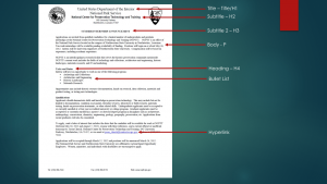
And then, at the bottom, we also have our hyperlinks too, which is a different format, different file, different color. By providing labeling all of those, if a screen reader were to go down this list, it would understand that it needs to start at the top with the United States Department of Interior, work its way down, hitting those various points based on the logical order that we've provided into it.
Even special types of text, things like bold, italics, they all have their own values assigned for the Assistive Technology.
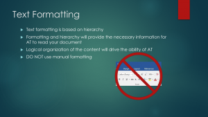
We're used to, if we want to put our Title on the page, typically the first thing we do is we start with our Title, we make it a little bit larger sized font, sometimes we may even put a bold character on there. If you utilize any of these functions off the home ribbon under font, you're not assigning any value to what is there. The Assistive Technology is never going to be able to unlock what's there, because all you're doing is, you're just changing the look of things. Think of this box more as an artistic style, but it's not providing any information. So, from this point forward, if you get one thing out of this short course, I want you to remember to never use this box again.
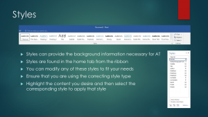
I'm sure all of us have logged into a Microsoft Word at one point in time, or another, and saw this neat little ribbon right at the top of the home tab there, and thought to ourselves, "Hey neat, if I ever want to make big blue text, there's a box I can click just to make that big blue text." I didn't really understand what it was for, the first time I saw it. However, just based on what we've discussed so far, hopefully you're starting to notice what some of these names are there. We have things like, Heading 1, Heading 2, Title, Subtitle, Intense Emphasis, Quotes, Normal.
So, we know that by using these boxes, we're going to provide that tag, that H1, H2, T, P, by using each one of these boxes. It's putting that tag on each type of content that we're creating. And, the beauty is, you're not stuck with that blue, all of the time. You can modify these styles to fit any of our needs. And that, I think, is a big problem that Microsoft has is, not really explaining, right off the bat, how functional these style tools can really be. Really, all you have to do is ensure that you're using the right style type, we can double-check in our smaller styles box here and make sure that we have all of the different parts of our document that we need. Literally, all you have to do, is highlight the content that you desire, and click the appropriate style.
If we think back to our body of our paragraph, all we want to do, from this point forward, when we start creating these documents, is we just want to put content on the page. We don't want to worry about centering that content, we don't want to worry about making it bold, or making it italics, or putting a different font on there. All we're going to want to do, is put all of our content, from beginning to end, on the page, and then go back and highlight the sections and name them with our styles. It's going to take some getting used to, because it's a different approach than most of us are used to taking. But, I promise, that eventually we'll become more efficient and your work will definitely be much more ready to be 508 compliant. I don't want to say it's always going to be 508 compliant, but we're much better setup there.
What we're going to have to do, in order to do any of this, is we're probably going to have to modify most of our styles in there. We know that in The National Parks Service, we utilize the Graphic Identity Program, to help carry our brand out there. We utilize specific fonts to help carry the gravity and the gravitas of the National Parks Service. We use that black band across the top. Or, the use of our arrowhead. All of that is really designed to reinforce that this is a National Parks Service product. In order to do that, it's really going to become necessary that we modify the style.
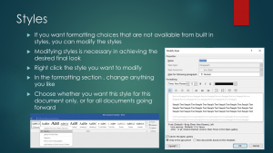
You can change anything you like in there, and the really neat thing is that, you have the option to either use this just in that, one off, document that we're creating at that time. Or, you can save that style moving forward. Saving that style moving forward, and especially on something like our normal, we know most of our body checks tend to be about a size 10 or size 12 font NPS Ralston, without a bold on there. Save that as your normal, then you don't have to worry about modifying this in the future.
So, really simple, huge impact, but it definitely takes a little practice. It's not always going to be the case that we're going to be able to use just the small list of styles that Microsoft provides for us. If we have longer documents, documents with a lot of different sections to them, or you just want a different graphical appeal, because remember whatever you label as a particular style, that is the only style that can be assigned to that content. Let's say, for example, we have two headings that are at the same level within an outline, but we need two different looks. We're going to need two different styles. Each style can only be used one time.
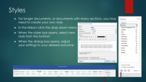
Just with those few easy steps right there, we're still getting our same graphical look that we want to see in our final documents, but we're also providing that tags layer, with all of that information to understand what is on the document.
There is our styles. We've now effectively formatted our text. Next we want to move on to any objects. And, like I said before, objects can really include anything. Things like images, headers, footers, data tables, watermarks. Really, anything that's being provided in a visual way. As far as 508 compliance is concerned, it's necessary for us to provide information for screen readers to access the data that's there. So, what that means for us is that like, for images, for example, all images must have some type of alternative text with it. A caption, or information around the image to help unlock what's in that image. If you've ever held your mouse over an image on the web, and a small little yellow box pops up that says, "Man-eating cotton candy." That's alternative text. We can assign all of that, within Microsoft Word. I'll show you how to do that in just a minute.
We need to use table headers, it's the only way that Assistive Technology is able to understand what is found in your data table. So, you definitely need to make sure that we're using headers with all of our tables. This one seems a little strange, but you must place the table inline with other contents. What I mean by that, is if you place a table that is at the bottom of a page, and we're discussing it at the top of the page, when a screen reader goes down through there, it's going to be out of the logical order. By placing it inline with the content, where it's being discussed, it's going to keep and maintain that logical order to things.
So, for Headers and Footers again, you want to the built in features to insert a Header and Footer. Always remember, "When in doubt, insert." Watermarks is going to be the only different one we have. If we're doing something that's a draft, or a not for distribution, that kind of thing. We're going to have to reproduce that wording, somewhere in the document. At current technologies, there is no way for Assistive Technology to access a watermark. Pretty easy, usually there's not too much involved with the watermark, but just something to think about.
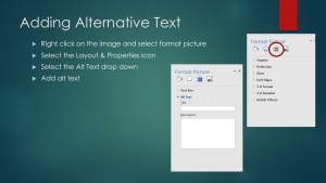
In order to do that, you just go to the image you placed in there, and you want to right-click it, and select the Format Picture option. When your Format Picture dialogue box opens up, you're going to want to select the Layout and Properties icon, which is that icon that is a little square with arrows pointed to all four corners there. Once you select that, another box is going to open up, and you want to select the Alt Text box. In there, you're going to want to put the information into the description section, in there. The Title is not necessarily as important as the description is. The Title really becomes more important when we have a lot of images within a document. One of the really neat hidden features of styles is that when you appropriately use styles you can actually automatically generate a Table of Contents at the end. If you have a lot of images, putting a Title in there is going to help with that logical ordering of the Table of Contents.
That's one feature in there. I don't worry too heavily about Title for my own work, but I definitely, absolutely, want to include some alternative text within our description box.
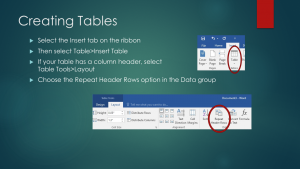
So, our hyperlinks. Now, our hyperlinks probably isn't going to a huge departure from what we're used to doing. Most of us typically highlight the content that we want to become a hyperlink, and then we right-click it and use the Select Hyperlink function. When we do that, this little Insert Hyperlink box pops up, and when that does, there's two areas where we have the opportunity to effect the information in there. Either the text to display, or the address. Obviously, text to display is what's going to be displayed in your document, and the address is the link to which you're sending your reader to.
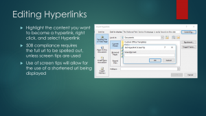
It's not always ideal to have all of our URL's written out on screen. So, I'm going to point out what a ScreenTip is, but I always recommend using a bit of caution and not using these abundantly, but a ScreenTip is ostensibly an alternative text for words, on a screen. So, if you've ever held your mouse over one of those areas that says, "Click here for more information." And a link pops up, that link that you see there is our ScreenTip. So the ScreenTip will actually read that whole URL out to an individual, so we definitely want to use the ScreenTips, if you need to. Just click that ScreenTip box up in the upper right-hand corner, the Set Hyperlink ScreenTip will come up. My usual recommendation to fall within 140 characters is to not have it leave that line. Try your best to keep it in that line. Sometimes long URL's, there's no way we can do anything about it.
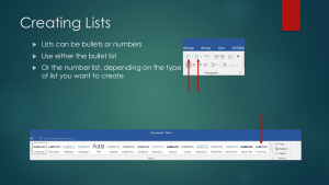
So, as long as the appropriate styles are showing up for the appropriate type of content, then we know what we're doing is at least working, for right now.
So, we went through and we addressed all of our big issues, not issues, excuses me. Things like Images, Tables, Hyperlinks, all of that stuff. Now we need to think about our color. And, color is something I don't think a lot of us put too much thought into, other than whether or not we like a particular color. But, color has a lot of different aspects, especially when it comes to 508 compliance. What I mean by that is, you really don't ever want to use color alone, to convey any kind of message, right? Let's take a look at an example of something that we, most of us, as sighted individuals, have encountered before.
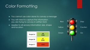
Those of us, as sighted individuals, most likely can look at this and garner some really quick, basic information. We know project A is probably doing pretty good, it's got that nice bright green on there. Project B might be somewhere in the middle, maybe it's at risk of being late, or overdue, or something like that. And, maybe project C is late, or it's not good, it's wrong, or something. It really conveys a message to us. Non-sighted individuals are going to have no opportunity to understand what's there. But, with one simple change, we can unlock that information for them. And, it has not taken away from the graphical representation of what we're trying to do. We can still see the green with A, the yellow with B, and the red with C, but now we've provided that background information for those individuals. We know that A is on-time, B's at risk, and C is late.
So, definitely want to start thinking about that kind of thing. And, it's not just color, it really applies to all sensory information. Size, shape, location on the page, all of those things that are conveying a message without utilizing a word. You have to kinda think about that, would you be able to provide that message, if that image wasn't there, or that color wasn't there. Something to think about.
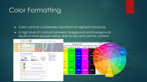
There is a specific contrast ratio, depending on the size of the text, that we need to meet, in order for it to be considered 508 compliant. And, there's a couple of tools that can really inform us, a really simple tool we can use is just a basic color wheel. Introduced to us at a very early age, it's really functional for us, because we know we can take a slice of a color there and look directly across and that color is usually it's direct opposite contrast. So, looking at this here, we know that if we have purple background, we'd want to use a yellow text. We know we're going to have a really nice high-contrast ratio there.
Sometimes, we need a little bit more help. There's a lot of really great resources online. I particularly like to use the WebAIM Contrast Checker. I like this because you can put the RGB color numbers right in there and find out exactly where those two colors fall within contrast of one another. The really neat thing that's on here, is this little slider, you see right in this area right here. You can actually slide that either lighter or darker, to ensure that all of your text is passing, so that allows you to use the colors that you want to use, while still hitting that contrast ratio. So, something to think about because 508 compliance doesn't always benefit just folks with disabilities, it can really benefit everybody.
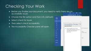
So, what you want to do is, you want to navigate over to the File Option, and once you click on File, this box will open up, that you see here, and you'll see the info all the way on the top, and you want to select the info. You want to select the Check for Issues box, which is that center box, right in there. When you select that box, you get a couple different options right there, and you want to Check the Accessibility. Now, when you click that option, you're going to get another box that comes up and, ultimately, this is what you want to see. You want to see the note that says, "No accessibility issues were found. People with disabilities should not have difficulty reading this document."
If there was some sort of issue with the document, it would be listed here with tips on how to remediate that. If there were too many issues on there, it might recommend that you try a different way. It's a really handy tool to help us to check the work. It's certainly, by no means, infallible. We want to check early, check often. I check a few times throughout the creation of my documents, just to make sure I don't have a huge workload at the end. So, we always want to make sure that we're going through and checking our accessibility.
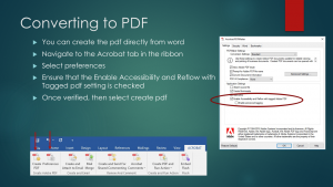
Once you click that option to select preferences, you're going to get your PDF maker options box to come up. You want to make sure that the Enable Accessibility and Reflow with a tagged Adobe PDF, is selected. In our day and age, we now access electronic information on a variety of different screens, whether it's our desktop computers, laptop computers, tablets, handhelds, cell phones, smart phones, everything in between. Whenever we change the size of the screen we display our information, we have to do what is called Reflowing our text. So, that way you don't have to constantly scroll across smaller screens to access all of the information. By selecting this option, it's going to allow the PDF to Reflow with that, while still maintaining all of those tags we've taken all of that time to put in there.
So, we want to make sure that always we have that Enable Accessibility and Reflow with tagged Adobe PDF option selected. Once you verify that that's selected, you select create PDF, and there it is. We now have a Section 508 compliant document ready to go.
So, that was a lot. There's lot of steps in there. Pretty simple, but I just want to go over the basic steps to the compliance, one more time. We really just want to setup our document. Make sure that we're starting off on the right foot. We've got our feet in a great place to start. We want to format our text. We want to make sure that we format all the objects, all that stuff. We want to make sure that we do our color formatting, and then ultimately we do our accessibility check and production.
So, there it is. All of that, in about 50 minutes, and we're going to be all 508 compliant experts by the end of it. I do see at least a few questions come through. So let me see if I can get up here to our chat section and address any of those questions.
I also had a question as to whether or not I'll be sharing this recording. I will be sharing this recording. I'm going to send an email out in a little while to everybody that participated this week, and I will be including some links as well as some other resources for how to do this on your own.
Anybody else have any burning questions, or anything else they'd like to know? Alright, well I want to thank you all very much. My name, again, is Ryan Stubblebine, I will put that up here. I think this will work for it. If anybody has any questions or anything for me, you're more than welcome to email me at any point and I'll be happy to share my knowledge with you, best I can. And, if I can't answer it, we'll definitely find an answer for you. Otherwise, from those of us at NCPTT, we thank you very much and we hope you have a wonderful day.
Last updated: April 7, 2025
